Getting started with Contextual's Product Adoption platform (PA) for Web apps.
This article will go through the basics of the Contextual's PA and teach you the basics of how to create content and deliver it to your employees or your customers using the Contextual browser extension.
Prerequisites
-
If you haven't already, you will need to download the Contextual browser extension. The extension can be used on either Google Chrome browser (recommended) or Microsoft Edge. Download here
-
You will also need an account with Contextual. If you don't have one you can create one using the extension or by going here
What this article will cover
- Contextual Product Adoption Platform explained
- The basics of how to create content
- Key features of the Chrome Extension (and its interface)
Contextual for Product Teams
You can get started with the Chrome Extension to create Guides. But to deploy to your App users, you will need to integrate into your Web app to target and deliver those Guides. This means that your end-users do not need to download the browser extension to see the content that you create using the Contextual.
The basics of how to create content
Creating your first Guide
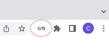
1. Go to the URL where you would like to create a Guide then click on the chrome extension in your browser.
The chrome extension is located on the top right corner of your browser.
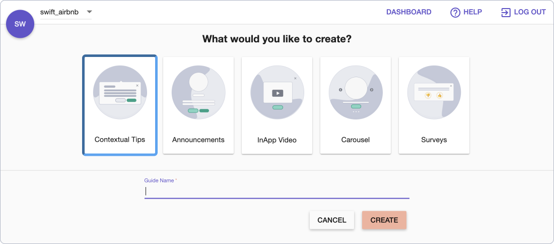
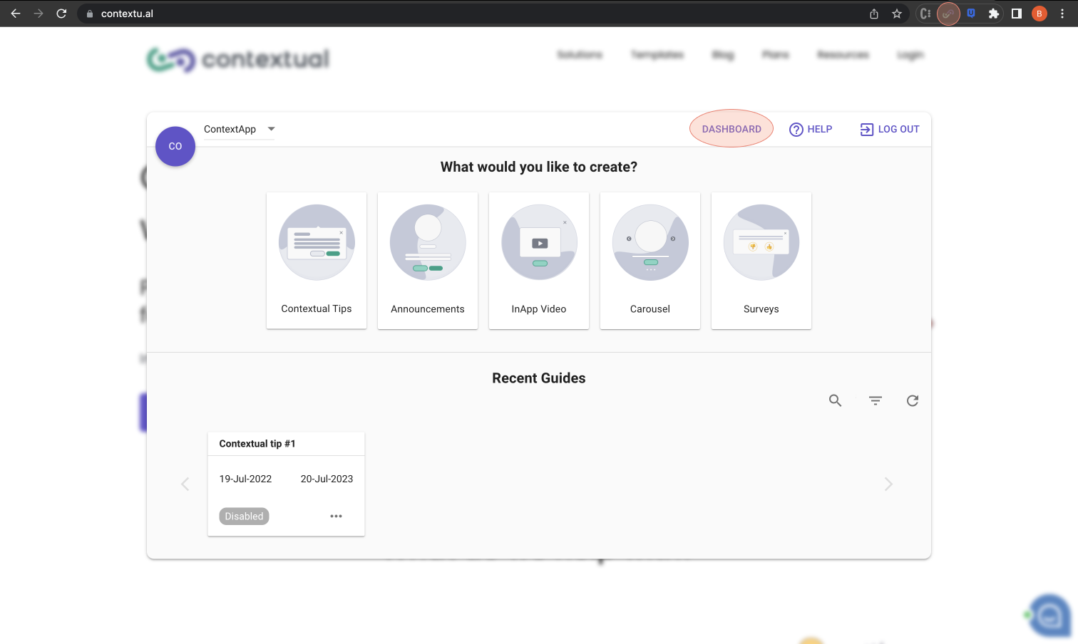
2. Select any use-case
There are different options from contextual tips to announcements, carousels, in-app videos and surveys
3. Name your guide
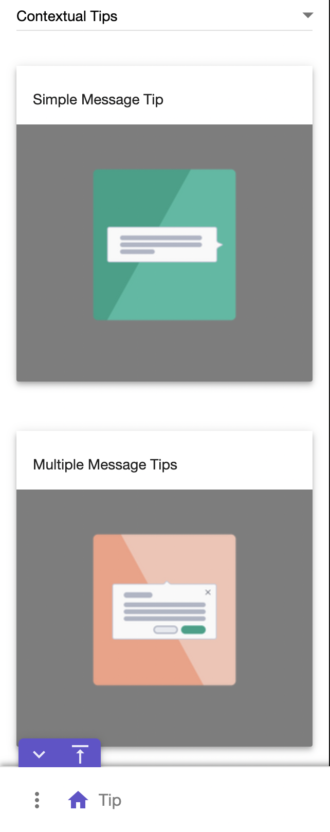
4. Choose a template for the design.
This step is completely up to personal taste and the utility you require from the tip. i.e If you want an image and or buttons.
For this example we will use a simple tip with no buttons.
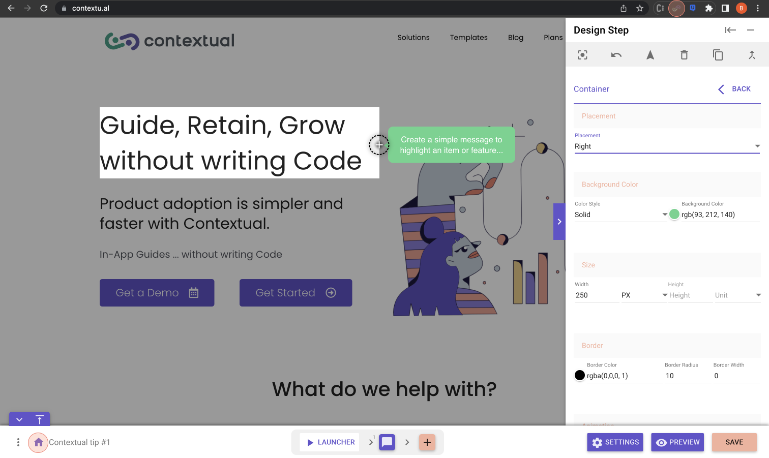
5. Place the tip on the screen
Once you have selected a design, you will then need to make sure that the extension is in "design mode" (more info lower in doc here), then mouse around your website to place the tip. You should see blue boxes appear around on-screen elements, any element that has a box around it can be selected as the target for the tip.
Please note that if you already have a tip design you want to copy then when in design mode you can click on the apply from others button at the top of the design menu.
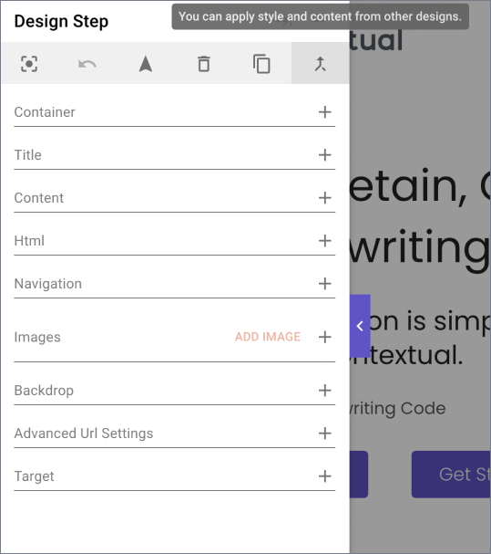
6. Edit the tip
This part is completely up to you, but one trick here is that if you click on the part of the tip/popup that you want to edit i.e the content, then the correct section on the side menu will open so that you can edit the content.
7. Click on Save
Once you have finished designing your content you will need to make sure that you click "save" located bottom right to save the design.
8. Preview
Once you have created your design you can preview how it will look to your end-user. If you have created more than one step you will be able to also preview how the whole flow will look.
9. "Exit" or navigate to the "Contextual dashboard"
When done with the design either click on the Home button located bottom left to be navigated back to the web guide creator's home page. Dashboard button is located on top right the page.
- Alternatively in order to close the web guide creator, simple click on the Chrome Extension icon.
Key features of the Chrome Extension
Below are some of the key features of the Product Adoption platform in a bit more detail.
Navigate/Design button
This section will go through how the navigate/design toggle works and a couple of tricks on how to use it.
How it works
Design - This is the default mode when after you first pick a design, in this mode the tip or pop up you are designing will be visible on the screen. If you are designing a tip then you will be able to mouse around and place the tip.
Navigate - When this option is chosen, it will allow you to navigate to different pages within your site. You can navigate to different pages by clicking on links on the page. Once the new page and the creator load you can either navigate again or click on the Design button to see your design again.
Once you have clicked done on your design for that page then the creator will save the current URL for that step.
Tricks and Tips
-
If you are creating content across multiple pages, Contextual will automatically link the steps across the different URL's. Watch out for dynamic Url's though as Contextual will try to take the user to that exact URL. More on dynamic URLs here
-
If you want to change which URL some Contextual content is on then you will first need to open the step that you want to move (Contextual will take you to the page where it is currently saved, then all you need to do is click on Navigate, then go to the new page, click on design mode, place the tip (if a tip) on a new target element and then click on done to save the URL for that step
Side menu
This section will go through a couple of the important settings from the side menu.
Backdrop
Backdrop is where you will find the design options that control the background dim level and colour, you will also find the option to highlight the element that tips point at.
Dynamic URL
If the URL you are trying to build content on has some sort of dynamic element, such as an account ID or project number i.e yourapp.com/projects/randomprojectd . Then you will need to make sure that you the advanced URL settings. More info here
Changing the order of the steps
When you have created a Guide with more than one step and you would like to re-order the steps, all you need to do is drag and drop the steps into the correct spot and then save the changes.
Hotspots and Launchers
This is where you get to decide how you want to trigger the Guides that you want to show your users. More info here
Page open - This is the default launcher, this means that when the user opens the url that you have specified for the Guide.
Button - This allows you to put tooltips all over a Web app that users can then click on to get help when they need it. You will need to select an element on screen for the button to attach to (similar to a contextual tip)
Click - To make an existing screen element (like a text label or button) clickable. The usage is quite similar to a button launcher, you need to attach it to an on-screen element and when a user clicks on the element the content you have created will be displayed. You will see a red box box around the selected element, this will not be visible to the end users.
Hover - Similar to a click launcher but when a user mouse overs the selected section it will trigger the Guide to show.
On-demand - Gives you the power to launch the Guide using code inside your app. Gives you the freedom to time it and repeat it however you like.
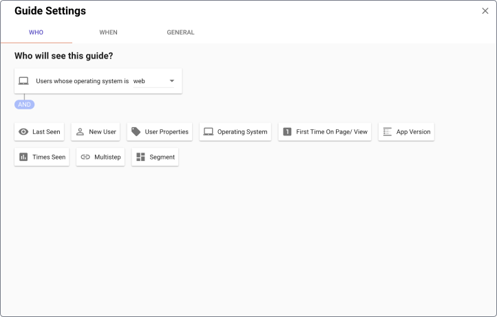
Audience (Who)
-
The audience section is where you can choose what segment of your users you want to see the guide you have created. Below is a few important things to know about the audience section
-
Operating System is a mandatory filter.
-
When you add multiple filters they get applied as an and. For example, if user is a web user and a new user who started using the product less than 14 days ago then they show them this guide (example image below).
-
You can see the number of possible users who will see the guide by clicking on the refresh button.
When
You have two options here
-
Show until the user completes - This will show the Guide only once to the user.
-
Show "..." number of times
-
Repeat forever - This setting will mean that the Guide will keep getting shown forever. This is good when you want a tooltip (button launcher) that is always available.
Settings
Once you have created a Guide and chosen the audience and launcher the last step is to check that the settings are all correct for the Guide.
Below are a couple of the more complex settings explained.
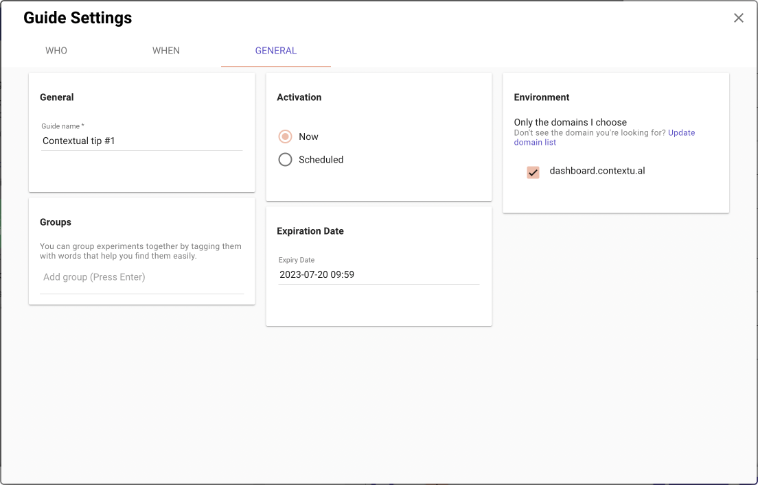
Environment
This allows you to select what domain and subdomain the Guide will be shown on.
If you choose yourapp.com, it will only show on yourapp.com
You can also specify a specific subdomain, such as staging.yourapp.com or dashboard.yourapp.com. This is useful for only showing the Guide to your staging environment for testing.
If you choose .yourapp.com, it will match all subdomains, for example, prod.yourapp.com and staging.yourapp.com.
If you choose yourapp.com, it will match all domains contains yourapp.com, for example, hello-yourapp.com, yourapp.com, prod.yourapp.com, and staging.yourapp.com.