Accessibility and WCAG compliance
Making Contextual content accessible to all users is important to us. We understand that users may have varying accessibility requirements so we have designed our product so content can be customised to suit different user needs.
In the following document, we have compiled a list of tips and recommendations based on the 4 broad principles outlined in the WACG 2.0 standard.
Perceivable
"Information and user interface components must be presentable to users in ways they can perceive"
-
Text on Contextual is able to be read by most screen readers. (We have tested on mainstream Android and iOS devices)
-
We recommend that whenever you are using images or videos to describe something, that you also use text so that screen readers are able to help describe the image.
-
When designing content it is best to make sure colour is not the only tool used to distinguish between elements. i.e Using borders around buttons, using box shadows and a dim layer to differentiate layers also helps (image below).
-
Use easy to read fonts and text size that is adaptable to all screen sizes.
-
The best way to ensure your users are able to correctly view Contextual content is using tags. We suggest tagging your users that have different accessibility requirements. You can then design and target content that will be best received by them. i.e Different language, no videos and larger text for visually impaired users. Document on tagging here and video here
Operable
"User interface components and navigation must be operable"
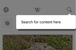
- You can set up Contextual widgets in a few ways so that you can make it easy for your users to navigate through a tour. For buttons on widgets, we recommend using contrasting colours, rounded edges and small borders so that users can easily identify what elements are buttons.(example below)
-
Here is a useful link on designing buttons
-
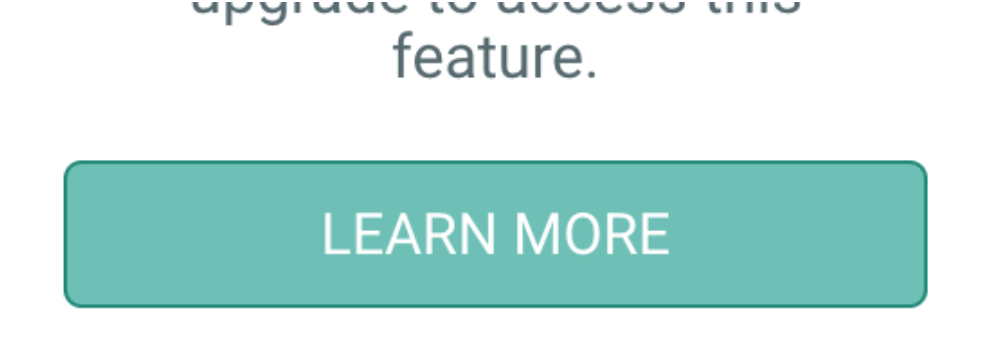
It is also important to make sure buttons are not too small so users can easily press them. If buttons are not a viable option due to size constraints (usually for small placed tips, example below), by setting ‘Touch in’ to on (image below), users are able to touch inside the tip to proceed or dismiss the tip. Touch in/out settings can be found in step 3 of design at the bottom of the appearances tab.

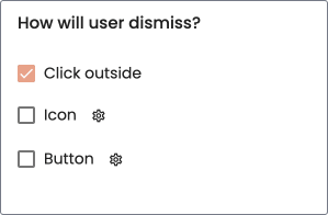
- When designing content there is also an option to set ‘Touch out’ to true (image below). This allows users to dismiss a tip/popup by clicking anywhere on the screen outside of the tip.
Understandable
"Information and the operation of user interface must be understandable"
-
For mobile experiments, it is best to keep the amount of information on each tip/pop-up to a minimum (1 information point per tip/popup), this will help to ensure the content is understandable by the user.
-
To ensure the content you are presenting your users is understandable, we recommend creating and targeting content to specific user groups. Link to tagging here
Robust
"Content must be robust enough that it can be interpreted reliably by a wide variety of user agents, including assistive technologies."
-
At Contextual we have strived to get our solution to work with as many different platforms and devices as possible. As these platforms evolve and new devices emerge we will continue to update our software to maintain compatibility.
-
A list of what platforms we currently support can be found here